What Is Skiplytics? How Queue Management Analytics Turns Wait-Time Data into Business Decisions

20 May 2026
Queue management systems collect a lot of data — ticket volumes, wait times, service durations, staff utilisation, and customer flow across every branch you operate. The question is what you do with it. Most businesses access that data only as raw exports, if at all. Skiplytics changes that. It is the built-in analytics layer of Skiplino’s queue management system, converting your operational data into live dashboards, historical comparisons, and geographic heat maps — without any setup, data mapping, or additional tools.
This article explains what Skiplytics does, what each feature actually shows you, and the types of decisions it is designed to support.
What Skiplytics Is and How It Works
Skiplytics is a business intelligence (BI) module built directly into the Skiplino platform. It pulls data from your Skiplino queue management system automatically — every ticket issued, every service completed, every agent session — and presents that data in structured visual formats that branch managers, regional directors, and operations teams can act on.
Because it runs inside Skiplino, there is no integration to configure and no separate login. Once your Skiplino account is active, Skiplytics has access to your full operational history. It supports up to five years of historical data, which is enough to identify seasonal patterns, benchmark year-on-year growth, and evaluate the long-term impact of operational changes.
The Four Core Analytics Features
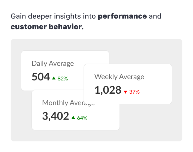
1. Visual Dashboards with Historical Trends
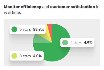
The primary view in Skiplytics is a dashboard that displays ticket volumes, waiting times, and service times as line graphs, bar charts, heatmaps, and pie charts. These are not static reports — the dashboard updates with your live queue data and allows you to filter by branch, service, or time period.
The historical trend view is where the dashboard becomes genuinely useful for planning. You can compare current-period performance against the same period in a prior year, which makes it straightforward to identify seasonal demand spikes. For a bank or government service centre that sees heavier footfall at the start of each month, for example, this view makes those patterns visible as data rather than anecdotal observation.
2. Monthly, Quarterly, and Yearly Breakdowns
Skiplytics lets you switch between monthly, quarterly, and yearly views. The granularity matters depending on the question you are trying to answer. A monthly view is useful for tracking whether a process change — a new teller assignment, a revised service flow — has had an immediate effect. A yearly view is better for capacity planning and identifying whether overall demand is growing or declining across your network.
The flexibility to move between these views without switching tools or exporting data is what makes Skiplytics practical for day-to-day operational decisions, not just quarterly reviews.
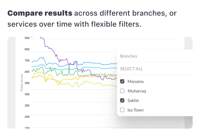
3. Historical Comparative Analysis
This feature lets you place two time periods side by side and compare performance across them using trend lines. The most common use is comparing the current month against the same month last year, or comparing two branches against each other over the same period.
For operations teams managing multiple locations, the comparative view is useful for identifying outliers — a branch that is taking significantly longer to serve customers than others with similar ticket volumes, for instance, or one that has improved substantially after a staffing change. Spotting those patterns in a dashboard view is much faster than cross-referencing exported spreadsheets.
4. Geographic Heat Maps for Strategic Planning
The geographic heat map shows where ticket bookings originate, plotted visually by location. This feature is particularly relevant for organisations managing branch networks — banks, telecoms providers, government agencies, and retail chains — where understanding physical demand distribution directly affects investment decisions.
A practical example: an organisation with ten branches may find through the heat map that three locations generate the majority of walk-in volume, while two others are consistently under-utilised. That data supports decisions about where to open new branches, where to reduce or redeploy staffing, and where targeted service campaigns would have the most reach.
Integration and Ease of Use
Skiplytics is designed to be operational the moment your Skiplino account is configured:
- Automatic data sync. Skiplytics reads directly from your queue management data in real time. There is no import process, no CSV upload, and no middleware.
- No setup or training required. The interface is built for business users, not data analysts. Filtering by branch, adjusting the date range, and switching chart types are all single-click actions.
- Mobile responsive. The dashboard is accessible from a phone or tablet, which means branch managers can check performance without being at a desktop.
This is relevant in the context of Skiplino’s broader platform. The same system that handles in-branch kiosk ticketing, remote mobile queuing, SMS and WhatsApp notifications, and agent desk management also feeds Skiplytics automatically — there is no separate data pipeline to maintain.
What Skiplytics Helps You Decide
The analytical output of Skiplytics is most useful when mapped to specific operational questions:
Staffing decisions. If the historical dashboard shows that ticket volumes peak between 10am and 12pm every weekday, you have a data basis for scheduling more agents during that window rather than distributing staff evenly across the day.
Branch performance. If the comparative analysis shows that one branch has a significantly higher average service time than others handling the same services, that is a prompt to investigate whether the issue is staffing, process, or layout.
Network expansion. If the geographic heat map shows that a large portion of bookings come from an area with no nearby branch, that is a data point for a location decision.
Seasonal planning. Five years of historical data means you can compare this January against the previous four. For industries with predictable demand cycles — retail around public holidays, government services at administrative deadlines — that comparison is directly actionable for capacity planning.
How Skiplytics Fits Within Skiplino’s Analytics Ecosystem
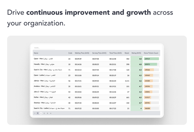
Skiplytics is part of a broader set of analytics and reporting capabilities in Skiplino. The platform’s reporting tool provides live data on waiting customers, agent availability, and service times for any given moment or date range. It also includes detailed per-ticket tracking — waiting time, agent, service duration, and optional customer data — as well as exportable reports and SLA notifications for services that exceed defined waiting-time thresholds.
Skiplytics builds on top of this by providing the BI layer: the longer-term historical view, the geographic dimension, and the visual comparative tools that turn operational data into strategic context. For a deeper look at how these capabilities work together, the Advanced Analytics guide and the Skiplino Insights overview cover the broader reporting architecture in more detail.
Frequently Asked Questions
What is Skiplytics? Skiplytics is the business intelligence module within Skiplino’s queue management platform. It converts queue data — ticket volumes, wait times, service durations, and branch activity — into visual dashboards, historical trend reports, and geographic heat maps.
What data does Skiplytics analyse? Skiplytics analyses data generated by the Skiplino queue management system: tickets issued (in-branch and remote), service completion records, agent activity, waiting times, and customer flow by branch and service type.
How does Skiplytics connect to Skiplino? Skiplytics is built into the Skiplino platform and syncs automatically. No setup, data mapping, or separate configuration is required. It becomes available once a Skiplino account is active.
How far back does the historical data go? Skiplytics supports up to five years of historical data, allowing year-on-year comparisons and long-term trend analysis.
What types of organisations use Skiplytics? Skiplytics is used across industries that manage high walk-in or appointment-based customer volumes: banking, government services, telecoms, healthcare, and retail. It is particularly suited to multi-branch operations where comparing performance across locations is a regular requirement.
Does Skiplytics require any training? No. The interface is designed for non-technical users. Switching between views, applying filters, and adjusting date ranges are handled through the dashboard UI without requiring data analysis skills.
Getting Started
Skiplytics is available as part of Skiplino’s queue management system. You can start a 7-day free trial to see the dashboards populated with your own operational data, or review the pricing plans to find the right tier for your organisation.
For a full overview of what the Skiplytics module includes, the Skiplytics product page covers the feature set and business outcomes in detail.
Latest


Similar Reads


All Rights Reserved @2026 Skiplino Technologies WLL.

Hi!
What are you planning to do?